Oceanographers generally love maps. They’ve made some pretty great ones like Marie Tharp’s who created the first map of the entire ocean floor: 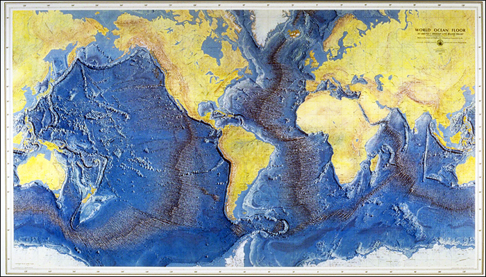
Recently, I wanted to make an oceanographic map for one of my projects. The World Ocean Atlas publishes data such as temperature, salinity, and nutrients for 1° grids all around the world. Looking to plot these data on a map, I asked some more experienced people how they did it. They answered MATLAB or ArcGIS. If you’ve read my post on Getting Started with Bioinformatics, you can probably guess that I’m a fan of free and open-source software. Was I really supposed to install and learn some new proprietary software? “This should be easy in python,” I said. Well, I was pretty wrong. I googled around, and as far as I can tell, no one has shared how to do this. So that you don’t end up banging your head against your computer all afternoon like I did, here is UnderTheC’s first programming tutorial:
Plotting World Ocean Atlas (WOA) data on a Map in Python
For this example, I’m going to use interpolated nitrate data on a 1° grid. You can use any parameter you want, but just be sure to download the data in NetCDF format. Here is the datafile that I use: http://data.nodc.noaa.gov/thredds/fileServer/woa/WOA13/DATA/nitrate/netcdf/all/1.00/woa13_all_n00_01.nc
First, required modules. You are going to need matplotlib, numpy, pylab, and netCDF4-python; we’re going to use the Basemap toolkit from matplotlib. Once you have that installed, go ahead and import them:
from mpl_toolkits.basemap import Basemap

import matplotlib.pyplot as plt

import numpy as np

from pylab import *formation about the

import netCDF4
Next, lets read in the data:
nc = 'woa13_all_n00_01.nc'

file = netCDF4.Dataset(nc)
lat = file.variables['lat'][:]
lon = file.variables['lon'][:]
nitrate = file.variables['n_an'][0][0][:][:]
The ‘n_an’ field means it is the mean objectively analyzed climatologies. You can see all the fields just be typing file or file.variables in python. More information about the different fields is availabe in the WOA documentation.
Now that we have the data, we need to set up our map. For this we need to set our map projections and what latitude and longitude we want the center of the map to be. There are tons of different map projections which are all described here: http://matplotlib.org/basemap/users/mapsetup.html. Different projections exist to portray the Earth which is a sphere onto a 2D surface. There are pros and cons to each which I won’t get into here, but you’ll need to decide which one is best for your map. For this one, we’ll use the Albers Equal Area projection and center our map on 45N, 135W.
map = Basemap(width=2500000,height=2500000, projection='aea', lon_0=-135, lat_0=45, resolution='l')
x, y = meshgrid(lon, lat)
xi, yi = map(x, y)
The last two lines convert the WOA latitude and longitude values to a grid that can be plotted.
I want coastlines, countries, grey continents, meridians and parallels so we can add that too:
map.drawcoastlines()

map.drawcountries()

map.fillcontinents(color='gray')

map.drawmapboundary()

map.drawmeridians(np.arange(180, 360, 6), labels=[0,0,0,1])

map.drawparallels(np.arange(0, 90, 6), labels=[1,0,0,0])
Lastly, lets get our nitrate data on it with a color scale and bar. Vmax will set the max value on our color scale. The last two lines add it to a map with a label.
cs = map.pcolormesh(xi,yi,nitrate)

cs.set_clim(vmin=0, vmax=18)

cbar = plt.colorbar(orientation='horizontal', shrink=0.5)

cbar.ax.set_xlabel('Nitrate umol/L')
Then we can save the file and show the map!
plt.savefig('map.png')

plt.show()
Voila! You should now have a ocean map with nitrate data!

